Many everyday designers assume that pairing green with red is as simple as matching two opposite colors, but green is just the beginning of a long hue continuum that leads toward red. Misunderstanding this transition often results in clashing palettes, washed‑out prints, or visual fatigue. Below we break down why the “green‑vs‑red” rule can be misleading and offer practical alternatives you can apply today.
Understanding the Spectrum: From Green to Red
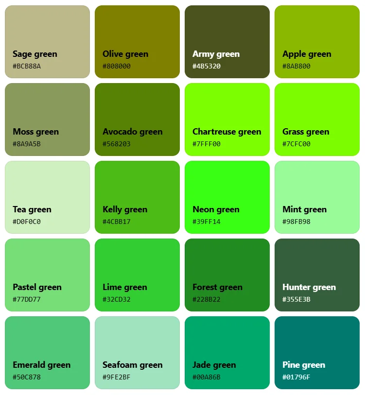
The visible spectrum moves from blue through green, yellow, orange, and finally to red. Green occupies a narrow band near 495–570 nm, but within that band there are dozens of distinct tones—from cool mint to warm olive. Recognizing these nuances is the first step toward intelligent color pairing.
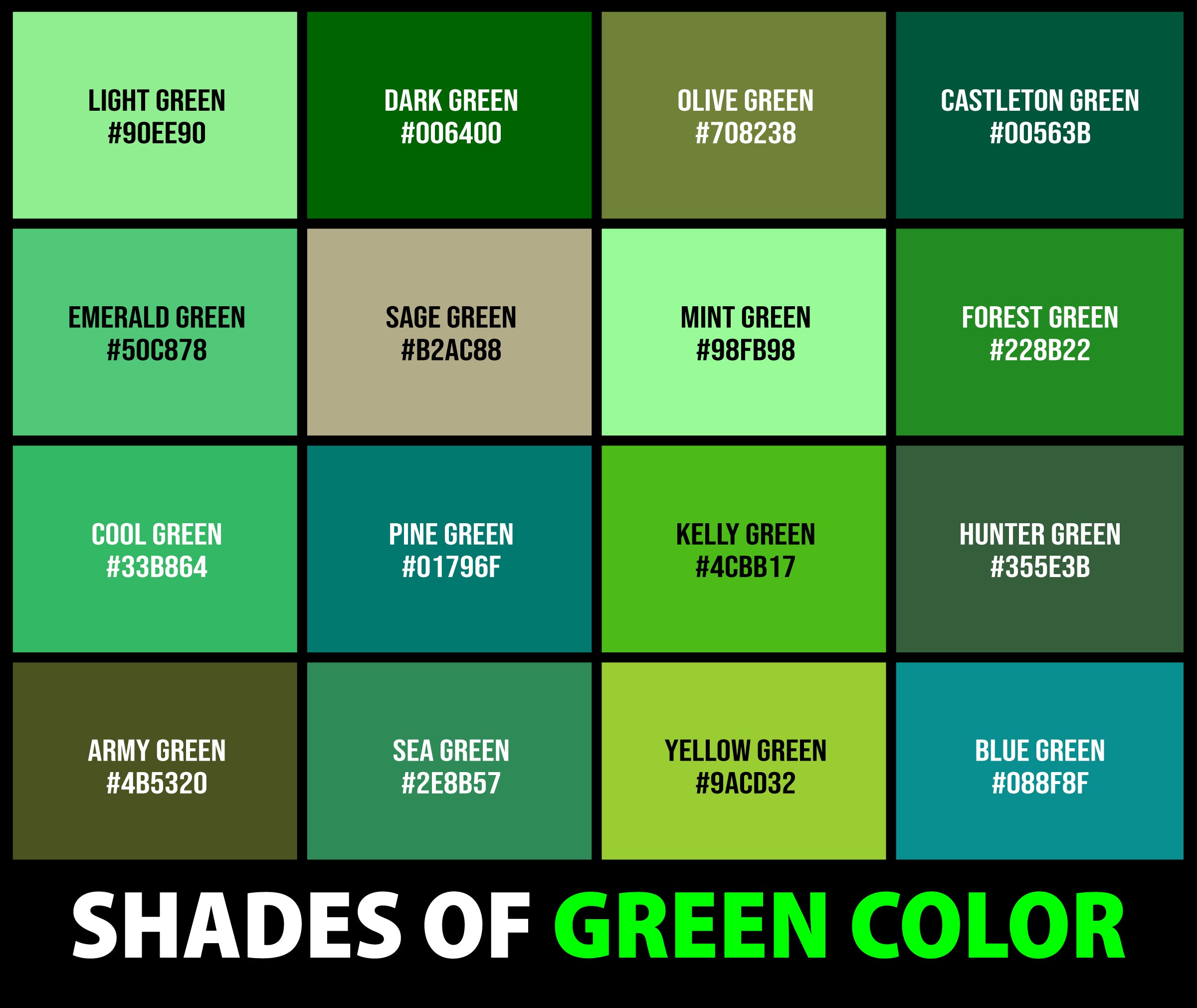
When a green hue leans toward yellow, it naturally edges closer to orange and red, altering its perceived temperature and contrast potential. Ignoring this gradient can turn a harmonious design into a jarring one.
Common Mistakes When Pairing Green and Red
- Assuming any green works with any red. A cool teal will clash with a warm brick red, while a muted sage may harmonize with a deep burgundy.
- Overlooking saturation. Highly saturated greens paired with equally saturated reds often compete for attention, making the overall composition noisy.
- Neglecting cultural context. In many Western settings, green‑red combinations evoke holiday themes, which can limit their use in professional branding.
- Forgetting about brightness. A pale pastel green next to a neon red creates stark contrast that can be harsh on the eyes.
Smarter Alternatives: Complementary Hues and Tints
Instead of forcing a green‑red match, consider these color‑theory‑backed strategies:
- Use a green‑orange‑red gradient that gradually transitions through intermediate hues, ensuring a smoother visual flow.
- Apply analogous palettes (e.g., green, yellow‑green, yellow) for a more cohesive look, reserving red for accents only.
- Mix tints and shades of the same hue—light sage with deep pine—rather than juxtaposing full‑spectrum opposites.
- Introduce a neutral (gray, beige, or white) to break up the intensity, allowing both green and red elements to breathe.
Practical Tips for Everyday Projects
Whether you’re redecorating a living room, selecting an outfit, or designing a website, these steps keep the green‑red dynamic under control:
- Pull a sample of the exact green you love, then use a digital color picker to find its nearest complementary orange before adding any red.
- Limit red to no more than 20 % of the total palette; this follows the classic “70‑20‑10” rule and preserves visual balance.
- Test your combination under different lighting—natural daylight vs. warm indoor bulbs—to see how the green‑to‑red transition behaves.
- When in doubt, replace red with a muted rust or terracotta; these hues sit closer to orange, easing the tension with green.
By recognizing that green is merely the starting point of a broader hue journey, you can avoid the pitfalls of simplistic opposites and create designs that feel intentional, comfortable, and visually compelling.
Green Trd Pro 4Runner

Green Trd Pro 4Runner
All Shades Of Green Color

All Shades Of Green Color
Green Color Meaning | Connotations & Shades
Green Color Meaning | Connotations & Shades
Light Green Backgrounds - Wallpaper Cave

Light Green Backgrounds - Wallpaper Cave