Designers and marketers alike constantly chase that elusive “wow” factor, yet many overlook a simple, repeatable structure: the 10‑by‑10 grid. When applied correctly, this grid transforms chaotic mockups into cohesive, eye‑catching visuals, boosting brand perception and conversion rates without the need for expensive software or endless revisions.
Why a 10‑by‑10 Grid Is More Than a Layout Tool
The 10‑by‑10 grid divides a canvas into 100 equal squares, giving creators a scalable reference that adapts from business cards to billboards. Because each square represents 1% of the total area, alignment becomes intuitive—no more second‑guessing margins or spacing. For value‑focused buyers, the payoff is clear: faster production cycles and a polished look that feels “professional” without hiring a senior art director.
Common Mistakes That Undermine the Grid’s Power
Even seasoned designers can trip up when they treat the grid as a rigid cage rather than a flexible guide. Below are the pitfalls that often go unnoticed:
- Ignoring Hierarchy: Filling every cell with content creates visual noise. The grid should highlight focal points, not drown them.
- Forgetting Negative Space: Overcrowding squares eliminates breathing room, making the design feel cramped.
- Applying the Grid Without Context: Not all projects benefit from a strict 10‑by‑10 layout; a mobile app screen may require a different proportion.

Smarter Alternatives: Grid‑Based Strategies That Actually Work
Instead of slavishly adhering to every line, treat the grid as a scaffold. Here’s how to extract the most value:
- Prioritize Key Elements: Place the most important visual (logo, CTA, or product image) within the central five squares to draw immediate attention.
- Combine Modular Blocks: Merge adjacent squares to create larger zones for text blocks, allowing natural reading flow while preserving alignment.
- Leverage Asymmetry: Slightly offset elements from the strict grid lines to introduce dynamic tension, a technique many top‑tier brands use to feel modern yet organized.
- Iterate With Prototypes: Draft quick wireframes using the grid, then test variations—swap colors, adjust spacing—to see what resonates best with the target audience.

Putting It All Together: A Quick Implementation Checklist
When you’re ready to apply the 10‑by‑10 grid to a new project, run through this short list to avoid the usual snags:
- Define the primary visual hierarchy before placing any element.
- Reserve at least two consecutive squares for negative space in each quadrant.
- Map out modular blocks—determine which squares will combine for larger sections.
- Test a minimum of three asymmetrical variations to gauge impact.
- Review the final layout on the intended device or medium to ensure scalability.
By treating the 10‑by‑10 grid as a secret weapon rather than a constraint, designers can deliver visuals that feel both meticulously crafted and effortlessly appealing. The result is a stronger brand presence, higher engagement, and ultimately, a healthier bottom line for any buyer looking to invest wisely in visual communication.
Secret Deodorant Logo
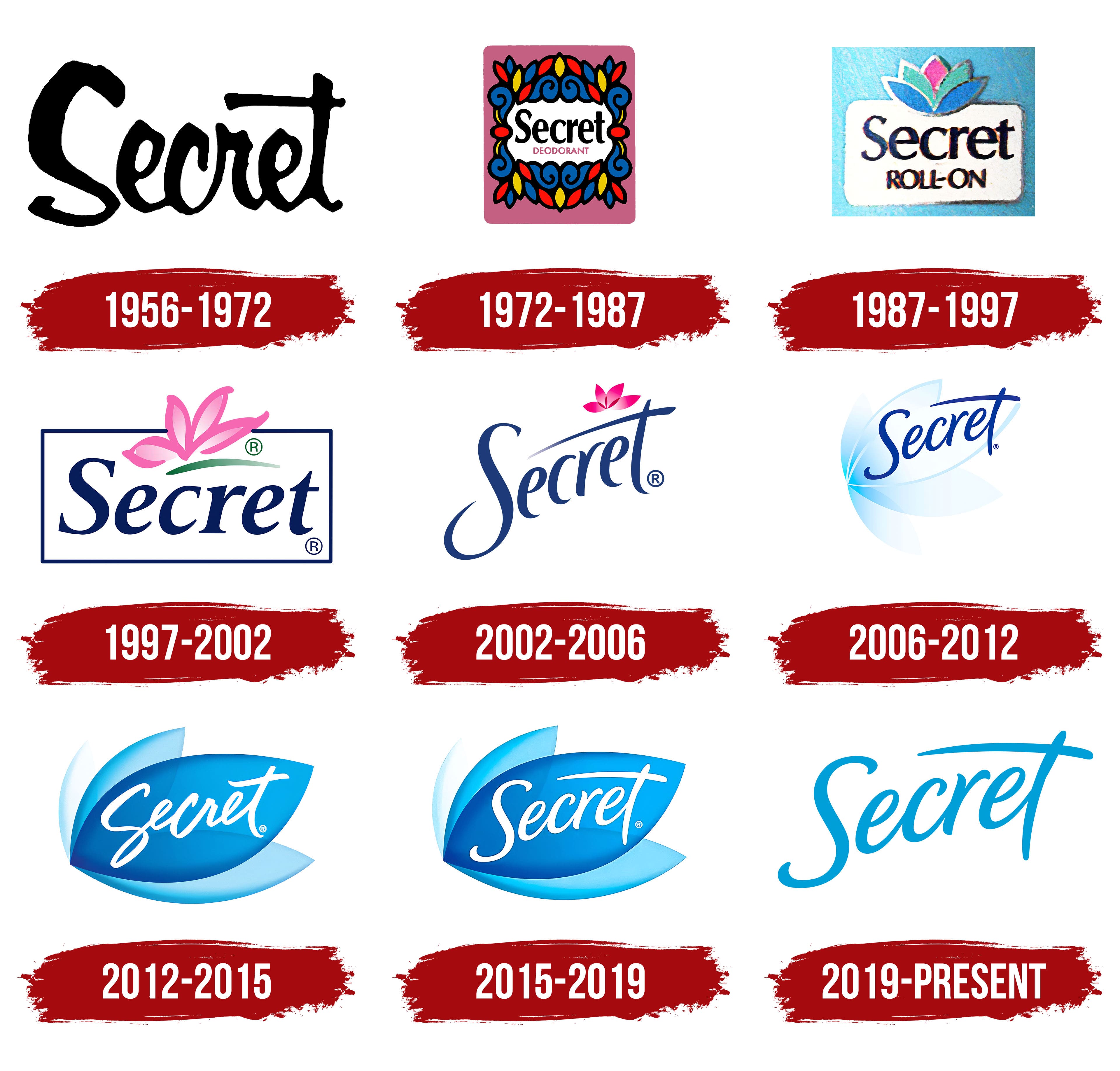
Secret Deodorant Logo
Secret (deodorant Brand) - Wikipedia

Secret (deodorant brand) - Wikipedia
Confidential Top Secret Stickers

Confidential Top Secret Stickers